Technology Workforce – What it takes to get in?

There was an article on the front page of USA Today of July 24, 2014, titled “White, Asian Men rule the roost at Twitter,” with a subtitle of “Very few women part of its technology staff.” It showed statistics at the largest, most well-known technology companies that I summarized in this chart:

Technology Workforce

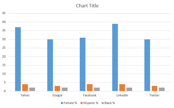
[source 1=”USA” 2=”Today” 3=”research” language=”:”][/source]


The article claims that nearly 90% of Twitter’s and U.S. technology staff in general are held by whites or Asians.

The article laments that the ethnic and gender makeup of the staff does not match the wide diversity of the users of the technologies and services of those companies. It hints that the companies should do more to add diversity to their workforce.

This whole argument is ludicrous to me. Do we really believe that Twitter purposely does not hire blacks and Hispanics but favors Asians?

Only 30% of Twitter’s workforce are women because of all the qualified people who apply for jobs there, apparently only 30% are women.

Are we suggesting that technology companies should reject white and Asian males who are most qualified for less qualified women and non-Asian minorities so that they may water down the technical expertise and therefore competitiveness of the companies and products?

I do not know why only 30 to 39 percent of women are interested to get the education and experience necessary to land jobs at the major technology firms. I do not know why not enough African and Hispanic Americans get sufficient technology educations and qualifications to land those jobs. For some reason, it may be educational foundation, it may be cultural background and history, some of these minorities just don’t qualify.  We need to deal with that.

Why is it that Asian Americans are represented in disproportionately large numbers? Could it be because their culture and background fosters education and hard work? Could it be because Asians spend some 20 hours more in school every week than the average Americans?

Indicating that there should be some type of technical affirmative action within these organizations to reduce qualified white, Asian and male hires in favor of lesser qualified minorities or women is ludicrous.

Yahoo, Google, Facebook, LinkedIn and Twitter didn’t get to where they are by hiring because of gender or race. They became what they are because they have perfected the art of hiring the best they can get their hands on and promoting and rewarding those employees to keep them.

Counterproductive articles like this one in the USA Today damage our economy by misguiding public opinion and fostering an attitude of entitlement among our young people.

The reality is: if you want a high-paying technology job at one of the big companies in Silicon Valley, you have work hard in high school, get into some good technology college, compete there with the best and brightest from all over our  country as well as the cream of the crop from China, India and all over the world, perhaps go to graduate school because many of the applicants to these firms have masters and doctorate degrees, and do a few years of grunt work in lesser firms or startups to gain job experience.  Then, if you are willing to work 80 hour weeks and move to the highly expensive Bay Area, you can go and apply. If you have enough communications and personal skills to make it through the interview process, you might just land such a job.

Nobody cares what gender, race or ethnicity you are.

You can trust me on that.

Elizabeth Warren and Student Loan Refinancing

Sen. Elizabeth Warren sponsored a bill that would allow students to refinance their student loans at today’s low interest rates – just like we all refinance our mortgages, if we can, to save money on interest and shorten the repayment cycle.

The initiative was funded, however, by having 22,000 millionaires pay “their fair share of taxes.” I understand that “fair share” is a subjective term. Our society largely agrees that the very rich get better treatment in taxes, proportionally, than the very poor. The very rich do not agree. They argue that they already pay the majority of all taxes, and the very poor pay none.

TaxShareTop1Bottom90_0

I lifted the chart above (Source: IRS) from the site www.taxfoundation.org. This chart tries to show several things: First, that the share of income taxes paid by the top 1 percent of earners has increased since 1980. You can also see the Bush 41 tax cuts, a sharp drop in 1988 on the blue line, and the Bush 43 tax cuts, the sharp drop in 2000.  You can see  that taxes for the rich went up steadily during Clinton. Contrary to what conservative opinion would have us believe by labeling Obama the redistributor, taxes for the rich actually went down during the Obama years.

The chart also indicates that the taxes for the bottom 90 percent went down steadily, then they jumped sharply during the Bush 43 “tax cut” time. Finally they started rising during the Obama years.

Or does it?

There is something wrong with this chart, in my opinion. This chart looks like if you are in the bottom 90%, where I am, for example, you used to pay over 50% in taxes in 1980, and now you pay “only” 32%, doesn’t it? It also looks like if you are in the top 1%, you used to pay under 20% in 1980, and now you pay 35%. Isn’t that what this chart looks like, if it is just presented like this?

But that is not really what it means. Talk about misleading statistics. The www.taxfoundation.org site’s first paragraph reads like this:

The top 1 percent of taxpayers pay more in federal income taxes than the bottom 90 percent. As you can see in the chart below, this is a stark change from the 1980s and early 1990s. But since the early 1980s, the share of taxes paid by the bottom 90 percent has steadily declined.

Aha, the top 1% pay more in the aggregate in federal income tax than the bottom 90%. That’s what this really means. This has nothing to do with individual tax payers, but the accumulation of all taxes paid.

Regardless of what the graphs look like, to me this indicates that the income gap has grown since 1980. The fact that the top 1% pay more taxes cumulatively simply means that the top 1% also make huge amounts of more money than they did in 1980, as compared to the bottom 90%. This chart actually shows that the rich are now much richer, because they cumulatively pay so much more taxes.

This is a statement about the drift of our society away from the middle class to a two class system, comprised of very few and very rich people in the 1%, and everyone else on the poor and very poor side.

That tells me that as a group, the 1% are doing just fine, just very fine.

Elizabeth Warren knows that. She also knows that the student loan refinancing act would have made lives easier for 40 million students by allowing them to refinance their loans. We’re not talking about forgiveness, or default, we’re talking about refinancing, just like we all get to refinance our mortgages when the interest rates support it.

37 Republican senators blocked and filibustered that act, and therefore stood in favor of 22,000 millionaires at the cost of 40 million student loan holders. That’s one millionaire protected from a rise in taxes for every 1818 student loan holders.

Here are the names of the Republican senators that blocked the bill:

Lamar Alexander (Tenn.)
Saxby Chambliss (Ga.)
John Cornyn (Texas)
Michael Crapo (Idaho)
Michael Enzi (Wyo.)
Charles Grassley (Iowa)
Orrin Hatch (Utah)
James Inhofe (Okla.)
John McCain (Ariz.)
Mitch McConnell (Ky.)
Pat Roberts (Kan.)
Jefferson Sessions (Ala.)
Richard Shelby (Ala.)
Roy Blunt (Mo.)
John Boozman (Ark.)
Richard Burr (N.C.)
Jeff Flake (Ariz.)
John Isakson (Ga.)
Mark Kirk (Ill.)
Robert Portman (Ohio)
Patrick Toomey (Pa.)
David Vitter (La.)
Roger Wicker (Miss.)
John Thune (S.D.)
Thomas Coburn (Okla.)
Daniel Coats (Ind.)
Dean Heller (Nev.)
John Barrasso (Wyo.)
Mike Johanns (Neb.)
James Risch (Ind.)
Marco Rubio (Fla.)
Rand Paul (Ky.)
John Hoeven (N.D.)
Mike Lee (Utah)
Ron Johnson (Wis.)
Deb Fischer (Neb.)
Ted Cruz (Texas)

It makes me wonder how these people expect to get reelected when they adversely affect 40 million voters to protect 22,000 rich people? They must expect to receive lots of money from the rich people, to make sure the poor remain as poor as possible.

How I Think about Charity and Non-Profits

Over the decades, when I had something to give away to charity, I would always just call Goodwill. They’d come with a big truck and haul my stuff away. In the decades before the Internet – and therefore Craigslist – when the kids grew out of their bicycles, that was the easiest way to get “rid of them” and contribute to a good cause.

Then, just recently, I saw a Facebook post to this page:

Charities
[click to enlarge]
Checking just the Goodwill section alone, this had me think that by giving to Goodwill, I have made a terrible mistake for many years, all my life, really.

Then I went to do some fact checking and found almost dozens of references to this chart being a scam, among them this site, which debunks the claims made by the above poster.

Specifically, for Goodwill, it states that:

Claim: CEO and owner Mark Curran profits $2.3 million a year. Goodwill is a very catchy name for his business. You donate to his business and then he sells the items for PROFIT. He pays nothing for his products and pays his workers minimum wage! Nice guy. $0.00 goes to help anyone! Stop giving to this man.
Facts: This claim is completely false. According to the Goodwill website: “82 percent of Goodwill’s revenues go directly into employment and training programs for people with disabilities and other barriers to employment!” Jim Gibbons is the CEO of Goodwill Industries International and his most recent compensation was reported to be $729,310. Goodwill has refuted some of these claims here.
Program Expenses:  92%

This made me feel better, and I have come to the conclusion that the only thing right about the chart above is that it is important to “Think Before You Donate.” Clearly, it’s paramount that we check out the organizations we donate money to, so we know what we are actually doing.

Finally, watching the TED talk in the video below was one of the most valuable 18-minute investment of time I have made in a long time. Even though I work with the government sector and non-profits every day, my conceptions of non-profits and charities, and the results they achieve, were completely wrong. This speech by Dan Pallotta, a fundraiser and charity expert, will change the way you think and feel about non-profits, their role in out society and their impact.


To get a higher resolution of this video, go to TED talks directly by clicking here.

Food Stamp Use by State

I recently took a look at a map of food stamp use by state (courtesy chartsbin.com) and found an apparent correlation between food stamp use and Obama vs. Romney states in 2012.

foodstamp use by state
Credit: http://www.chartsbin.com

It was sufficiently apparent to induce me to create a spreadsheet and do some calculations.

First I created the following chart, showing the states, their election results, along with the percentage of food stamp use.

Food Stamps Chart

Then I ran totals and percentage averages:

Food Stamps Totals

The results clearly document that red states have a higher participation in food stamps, on average, than blue states, but it is nowhere near as drastic as the map would have suggested.

This, of course, disregards the size of the state populations and therefore the results are skewed.

So I decided to add the population factor into the calculation by using the electoral college votes per state and weighting the above national averages accordingly. Basically a large state with a low percentage of food stamp participation, like California, brings down the average since it’s strongly weighted by the high number of electoral votes.

Food Stamps Chart 1

When I look at the results, it becomes obvious that red states have almost twice as many people on food stamps as blue states – on average.

A couple of surprising exceptions I noticed: Oregon and Michigan, both blue states, have very high food stamp participation numbers. California, my home state, shows surprisingly low.

Comparing Two Cities

I don’t know who to attribute this to, but I lifted it off Facebook from Jera Moran through a like by a friend.

TwoCities

The Safest Country in the World

In the wake of the Sandy Hook massacre, the NRA suggests that we need more guns – put trained guards with guns in all schools – which will make our children safer. If more guns create more safety, and if the United States, with 5% of the world’s population, has 50% of the world’s guns, should we not be the very safest nation in the world? All these guns in the hands of all these responsible, trained people, should be keeping us safe.

But we are not the safest country in the world. Not by a long shot.

Something is wrong with the logic.

Volcanos and CO2 Emissions – Truth or Hoax?

Fact Check:

When the Icelandic volcano Eyjafjallajokull erupted in March 2010, I received this mass email:

VOLCANOES – MAKING LIBERALS LOOK STUPID…NATURALLY! *FOOD FOR THOUGHT ….. this was sent to me by a friend, thought I would pass it along.  *

*Are you sitting down? *Okay, here’s the bombshell. The current volcanic eruption going on in Iceland, since it first started spewing volcanic ash a week ago, has, to this point, NEGATED EVERY SINGLE EFFORT you have made in the past five years to control CO2 emissions on our planet.  Not only that, this single act of God has added emissions to the earth estimated to be 42 times more than can be corrected by the extreme human regulations proposed for annual reductions.

I know, I know…. (have a group hug)…it’s very disheartening to realize that all of the carbon emission savings you have accomplished while suffering the inconvenience and expense of driving Prius hybrids, buying fabric grocery bags, sitting up til midnight to finish your kid’s “The Green Revolution” science project, throwing out all of your non-green cleaning supplies, using only two squares of toilet paper, putting a brick in your toilet tank reservoir, selling your SUV and speedboat, going on vacation to a city park instead of Yosemite, nearly getting hit every day on your bicycle, replacing all of your $1 light bulbs with $10 light bulbs …well, all of those things you have done have all gone down the tubes in just the past week. The volcanic ash emitted into the Earth’s atmosphere in the past week has totally erased every single effort you have made to reduce the evil beast, carbon.  And, those hundreds of thousands of American jobs you helped move to Asia with expensive emissions demands on businesses… you know, the ones that are creating even more emissions than when they were creating American jobs, well that must seem really worthwhile now. I’m so sorry. And I do wish that there was some kind of a silver lining to this volcanic ash cloud but the fact of the matter is that the brush fire season across the western U.S.A. will start in about two months and those fires will negate your efforts to reduce carbon emissions in our world for the next two years.

So, grab a Coke, give the world a hug, and have a nice day!

AND JUST THINK HOW RICH AL GORE HAS GOTTEN OFF THIS HOAX !

So what is really going on?

According to FactCheck:

It’s true that erupting volcanoes do emit some carbon dioxide, one of the “greenhouse gases” that contributes to global climate change. But according to USGS, human activities release at least a hundred times more CO2 every year than all the world’s volcanoes combined. Published estimates of the gas emissions from all volcanoes in the world range from 123 million to 378 million metric tons of carbon dioxide per year. Humans haven’t produced that little since the 19th century.

The problem is that when a denier tells you the content of the email above at a cocktail party, and you don’t just happen to be a climatologist who specializes in the study of the atmosphere, you probably don’t have the facts at your fingertips and can’t successfully argue against this outrageous, completely made-up, claim.

Fact check goes on documenting that the standstill of European air travel during that time, due to ash in the atmosphere, provided a significant offset of the CO2 emissions by the volcano:

Carbon dioxide isn’t a major output of volcanic eruptions. In the case of Iceland’s Eyjafjallajokull volcano, which began erupting in March 2010 and entered an explosive phase in April 2010, one study found that less than 15 percent of the gas given off in the pre-explosive phase was CO2 – the majority was water vapor. For some other volcanoes, the proportion of CO2 is even lower.

Still, that accounted for 150,000 to 300,000 tons of CO2 per day at the height of the Eyjafjallajokull eruption, according to wire reports. But the European Union’s air travel, which was shut down for days during the eruption, accounts for 3 percent of the EU’s total CO2 emissions, which according to the European Environment Agency was about 4,089 billion tons in 2008. That means air travel in Europe gives off about 340,000 tons of CO2 per day. The shutdown of air travel in much of Europe during the first week of the explosive eruption would have offset, if not greatly outpaced, the CO2 Eyjafjallajokull produced during that time.

The amount of misinformation spewed on the American public, driven by purposeful and targeted campaigns to dumb us down, is alarming.

Insinuating, after sprewing this volcano of garbage, that Al Gore somehow made up this “hoax” to get rich, is unforgivable. I would like to get a chance to compare the life-work of the writer of that email, who in cowardice wrote anonymously, to that of Al Gore. Then let’s have this argument again.

Now for the most important question: Who can pronounce Eyjafjallajokull?

Ludicrous Cost of Weapons

During the presidential debate, Obama accused Romney of spending an additional $2 trillion on the military. He didn’t say over what period of time (misleading statistics). But no matter what the time, $2 trillion is a lot of money.

A single Tomahawk cruise missile costs $1.5 million. We lobbed more than a hundred of those into Libya last year.

The Hellfire, an air-to-ground rocket that weighs only about 100 lbs each, usually shot from helicopters like the Apache, costs $115,000 each. When we see shots of helicopters shooting “missiles” into pickup trucks with three or four Taliban in the back on some desert road, that’s a $115,000 shot each time, to obliterate one old truck and a handful of terrorists.

The shoulder-fired Javelin is often used against a single human opponent, perhaps in a cave or foxhole. It costs $147,000 each. And they do miss sometimes.

Of course, the weapons are made in the United States by American workers.

Add up those numbers and then compare those to the cost of Big Bird.

The cost of the Libya bombing of a single day would have paid for a whole year of funding for the Corporation of Public Broadcasting, ensuring jobs for Jim Lehrer, Big Bird, and even Ernie and Kermit.

Romney sounds like a fool.

Bad Math in Oregon Foodstamp Article

The Katu.com article Pizza business and government fight over food stamp use talks about how the federal government does not allow Little Ceasar’s franchises to sell unbaked pizza to food stamp recipients, after first requiring them to spend “thousands” to install equipment and get ready to do just that.

At the end of the article, the writer, Dan Tilkin, slips in a statistic presumably designed to look impressive and slant the reader’s view:

According to the state Department of Human Services, about 80,000 people in Oregon receive food stamp assistance, better known as SNAP. That’s about one out of every five people.

There are about 3.7 million people living in Oregon. 80,000 of those would make about one in 46 people, not one in five. I wonder what Tilkin meant with that statistic.

Don’t trust what you read on the Internet.

Is It Fair?

Stephen Moore posted an interesting article in the Wall Street Journal titled Fairness Quiz. He asks a lot of questions of whether we think it’s fair. Here are some of them, with my comments attached.

Is it fair that the richest 1% of Americans pay nearly 40% of all federal income taxes, and the richest 10% pay two-thirds of the tax?

Here is a statistic that is deceiving at best and probably purposely misleading. Where does Moore get this fact, and does he realize the fact is incomplete? What is missing here is: How much INCOME did the richest 1% of Americans actually have? If they had 40% of the income, then 40% of the federal income tax burden, assuming a flat tax, would be totally fair. I do not claim to know what exactly the top 1% earned, but it is critical information necessary to evaluate a response to the question whether it is fair.

Is it fair that the richest 10% of Americans shoulder a higher share of their country’s income-tax burden than do the richest 10% in every other industrialized nation, including socialist Sweden?

So what? You cannot compare one country’s economics to that of another, particularly when they have vastly different systems. I can say for sure I’d much rather be in America in business than in any European country, no matter what their tax structure. Why are so many European executives and entrepreneurs coming to America? Is it fair? Apparently it is.

Is it fair that American corporations pay the highest statutory corporate tax rate of all other industrialized nations but Japan, which cuts its rate on April 1?

Where is it written that we need to do what other countries do? I would call it stupid if we allow other countries to exploit America economically. But I am certain that the exploitation has nothing to do with the statutory corporate tax rate. There are dozens of more effective reasons why we’re being exploited and why we’re allowing it, but that’s another topic.

World’s Richest Countries

The magazine The Economist of Nov 5, 2011 shows this chart of the world’s richest countries on page 56:

I suspect that the average American on the street will not be able to point to most of these countries on a map. I admit I would have had problems with Qatar, although I would have found the general neighborhood, I would not have been able to point to the right spot. The same goes for United Arab Emirates. And most definitely Brunei. Where the heck is Brunei? I think I would have found Singapore. Still, I think I would have done better than 90% of the people out there.

This is a very misleading chart. Take away the United States. What do all the remaining countries have in common? They are tiny. Here is the list:

Country Population
Netherlands 16,715,489
Switzerland 7,870,100
Hong Kong 7,108,100
United States 312,642,000
United Arab   Emirates 8,264,070
Brunei 422,700
Norway 4,978,000
Singapore 5,183,700
Luxembourg 511,840
Qatar 1,699,435

The smallest state in the United States, according to population, is Wyoming with 544,000 people. Wyoming alone is bigger than Luxembourg or Brunei. The big giant in this group is the Netherlands, with 16 million people. This is still only about 5% of the United States population. Adding up the population of all the other countries in the list makes about 52 million, which is about a fifth of the population of the United States.

When you look at it in graphic format, it’s even more drastic.

This chart is misleading, because without going through this process, the reader would simply lump the United States in with these other countries. It’s not hard to be rich in Brunei when all the people in the country would fit into a small town like Albany, New York.

The Economist did clearly state that the chart is for GDP per person. It just would have been helpful to point out this minor additional fact and put things into proper perspective.