Here is an incredibly bad chart in Bloomberg Businessweek of March 8, 2021 on page 32.
[click to enlarge]
If there were only more colors in the human-visible spectrum to distinguish between Taiwan and South Korea (both yellow in the chart) and Japan, Europe and Other (all grey in the chart) and China and U.S. (both purple in the chart).
The colors notwithstanding, can anyone make sense of this cart, like ascertain the market power of the U.S. chip manufacturers over time using this?
It is incredible to me how obtuse some charts are, even in world-class publications. Somebody spent time on making this and it didn’t down on them that they could use red, green, blue, brown, orange to supplement the colors?
There are 153 million registered voters in the United States and about half of them end up voting in the average election. So say it’s high and it’s about 80 million. Trump says that the postal service can’t handle that.
So let’s just assume that all 80 million voters that will vote do so by mail in the two months leading up to November 3rd.
Do you realize that the U.S. Postal Service delivers about 2 billion Christmas cards every year, most of them in the 3 to 4 week timespan before Christmas?
That means 2,000 million Christmas cards in 4 weeks are no problem for the U.S. Postal Service, but somehow 80 million ballots are a problem over 4 to 8 weeks before the election?
In the video above (at location 2:40) Tara Dowdell quotes Trump as stating the U.S. contributes 90% to NATO, and the actual number is only 22%. There are some misleading statistics at work here that need more analysis.
[chart credit: NATO]There are direct and indirect contributions to NATO. Direct contributions are made to finance requirements of the Alliance that serve the interests of all 29 members. They are not the responsibility of any single member. Costs are borne collectively, often using the principle of common funding.
The chart on the left shows direct contributions by NATO country. So here is Dowdell’s 22% figure. Germany, with 14%, carries the second largest burden.
But that does not represent the correct picture, and I believe that Trump didn’t refer to direct contributions. Trump often speaks inaccurately or imprecisely, to say the least, but I am sure that when he said that the United States contributes 90% of the cost of NATO, he meant the sum of the military spending goals of each country. So let’s analyze those separately.
I have been on record many times in this blog with posts about military spending of the United States. In this post of 2016 I show that the United States spends more on defense than the next nine countries combined. Trump’s increase of military spending this year of more than $70 billion alone is more than the entire military budget of Russia.
For NATO, the member countries agreed to spend at least 2% of their GDP on defense. So the chart below is another matter entirely, and it shows the defense expenditures by NATO country as a share of the GDP in percent.
[chart credit: NATO]This chart is pulled from the NATO website where there is a wealth of information and many charts.
Here you can see that the United States is the only country that far exceeds the 2% mark. Only four countries are above this guideline. Besides the United States, those are Greece (surprisingly), the United Kingdom, and Estonia. Everyone else is below or way below 2%. Note that some countries, like Romania, Latvia, Lithuania and Canada has significant increases since 2014. Trump tried to take credit for those increases recently, even though he had nothing to do with them. They were prompted by Obama pressure, and mostly by voluntary military buildup in the Baltic nations, which are close to Russia and feared Russian aggression after watching the Ukraine debacle.
Those are just percentages. When looking at the real numbers per country, the United States military spending in 2017 was $685 billion. The military spending of all other NATO countries combined was $271 billion. This means that the United States spent 71.7% of all military dollars of NATO. Not quite the 90% of Trump’s exaggeration, but a quite staggering amount.
Trump has said that “Germany owes the United States a trillion dollars for its defense.” This statement is obviously ludicrous. Nobody put a gun to the head of the United States and made it spend more on military than all other NATO countries combined. This has been going on for more than 70 years now. We all know about the $600 hammers and $10,000 toilet seats. I have been vocal in this blog about our defense budget and the price of a single F-35 fighter. Here is an interesting example about a $1200 coffee cup. The United States just loves its military and loves spending vast amounts of money on that military. Others simply can’t keep up, or don’t want to keep up.
NATO was created to form an alliance where all other members stand up for each other when one of them is attacked. After the end of World War II, that was critically important for the safety of Europe. After the breakup of the Soviet Union, I am sure it irked Russia that many of its satellites quickly switched sides and joined NATO, including Poland, Romania, Bulgaria, Latvia, Estonia, Lithuania, the Czech Republic, the Slovak Republic and Hungary. It didn’t look good for the Soviet ideology, and it does not look good for Russia today.
But in all those years the spirit of NATO was invoked only one time, and it was surprisingly in the defense of the United States after the attacks of September 11, 2001 and what transpired after that.
The United States started what many consider an illegal war in Iraq, and many of the NATO allies came to support America. NATO members spent massive amounts of money and many of their soldiers died in Afghanistan and Iraq in alliance with the United States.
So who owes whom money?
The United States spends massive amounts of money on its military presence in Europe and Europe has started taking it for granted. I remember growing up as a boy in Germany in the 1960s. I lived in a city with a large American military presence. As post-war children, we never really understood why the Americans were there. To us, it had always been that way. Today, almost half of all Germans want the American army to leave. They don’t see the point anymore. I suspect the same is true in many other European countries.
Trump says that the current arrangement “is unfair to the American taxpayer.” Well, it may be unfair, but it’s not Germany sticking it to the American taxpayer, it’s the American Congress and the administration, and the past administrations, all spending way too much money on military – and thus taking value and prosperity away from the taxpayer. But then, of course, there is the military industrial complex, which feeds a large sector of our economy. Maybe war is good after all?
With our current commander-in-chief, I wonder if the United States would honor its NATO obligations if Russia were to suddenly invade the Baltic states, or Poland? Talk about a world crisis!
In the end, perhaps NATO has run its course. Trump may be on to something. Maybe it’s time to let it fizzle out.
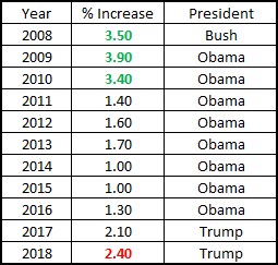
Going to have new equipment and well-deserved pay raises. We just got you a big pay raise. First time in 10 years. We got you a big pay increase. First time in over 10 years. I fought for you. That was the hardest one to get, but you never had a chance of losing.
— President Trump, United States Naval Academy, May 25, 2018
Actual military pay raises over the last 10 years:
I agree that some of these are less than serious, and when I researched them individually I found various discrepancies. For instance, I could not tell whether the number of people choking themselves while masturbating (autoerotic asphyxiation) is a world-wide or US statistic.
Then there are the lawnmowers, those vicious killers. I just could not believe that number, but as I researched, I found that lawnmower deaths are mostly due to rolling over into ponds and creeks, and drowning in the process. Some are due to riding the lawnmowers on streets and being run over by cars.
But my point actually is that our president has us all frothing at the mouth about evil terrorists coming into the United States and killing us. The entire nation is debating what we should do about those terrorists, and we are spending massive amounts of time talking about it in the national media. The courts are choked with it, all the way to the Supreme Court. With a partial ban in place, immigration facilities at airports are affected, needing manpower. Let alone all the lawsuits that will be filed on behalf of people who think they were wronged. This entire frenzy was created by a single, obsessed man, who has used this as a vehicle to gain power and to aggrandize himself.
If we really wanted to save American lives, making Americans safer, we should think about some of the other causes of death in the chart above.
For instance, we used to have a problem with lawn darts:
Over a period of eight years, lawn darts had sent 6,100 people to the emergency room. 81% of those cases involved children 15 or younger, and half of those were 10 or younger. The majority of injuries were to the head, face, eyes or ears, and many had led to permanent injury or disability.
— Google
Wow, we were able to make America safer by banning lawn darts! Now those 6,100 people over 8 years, or 762 a year, are no longer getting injured.
How about we ban latex balloons! It will save five children a year from choking to death. Let’s create a frenzy about that! Those evil balloon makers!
If President Trump and all our politicians were REALLY concerned with the health and safety of Americans, they would work on solutions to the opioid abuse epidemic we are dealing with in the United States right now. But they are not talking about that.
Trump does not care one bit about the health and safety of Americans. He cares about himself, and himself only. And his actions and inactions show that loud and clear.
In a comment on a friend’s post on Facebook, someone answered my question for examples on our military being weak, decimated, needing more funding with the following challenge:
Desert Storm was 2002 under GW Bush … The military has been descimated [sic] by Obama over the past 8 years. My question is have you not been watching the news for the last 8 years or just ignoring it??? Military is below pre-WWII levels … All branches.
I might note that he didn’t provide any examples, but simply taunted me with another set of questions: Have I not been watching the news? I don’t generally get my data from watching the news, but I try to do my own research. As we all know, there are too many “alternative facts” in the news and the “news media are some of the most dishonest people on the planet.” One can’t be too careful.
One of the core paragraphs in Trump’s inauguration speech was this:
For many decades, we’ve enriched foreign industry at the expense of American industry; subsidized the armies of other countries, while allowing for the very sad depletion of our military. We’ve defended other nations’ borders while refusing to defend our own; and spent trillions of dollars while America’s infrastructure has fallen into disrepair and decay.
— President Donald Trump
Whether I agree with its message and content or not, Trump’s inauguration speech was probably the most coherent and organized speech in his life, and the above paragraph is, in my opinion, the most important one.
I agree that things should change regarding American trade agreements, American industry and how we spend money on the military. I support all premises of the above paragraph, while only disagreeing with the “allowing for the very sad depletion of our military” part. I do not think we have depleted our military, as most people are led to believe by Trump and his supporters. Our military is not a disaster, and when our commander-in-chief makes such a statement, he insults all people in uniform.
Yes, the numbers are down for some things that no longer make sense. Remember the famous Obama statement in a debate with Romney four years ago: We don’t have as many horses and bayonets as we used to. I also think that it makes no sense to compare today’s military to that of pre WWII times. This is a massively different world and requires different analysis. Counting horses, bayonets and tanks makes no sense.
When Air Force Gen. Paul Selva, the vice chairman of the Joint Chiefs of Staff, was asked about whether the U.S. military had, in fact, been “gutted.” No, he argued. If it’s smaller than it could be, it’s still very powerful.
“At no time in my career have I been more confident than this instant in saying we have the most powerful military on the face of the planet. Do we have challenges? Of course we do. When you are faced with a global set of threats, you have to make choices on where you focus your energy.”
— Gen. Paul Selva
True, under Obama, military spending went down, and this is partly due to curtailing the massing hemorrhage of money in Iraq and Afghanistan during the Bush years. The chart below shows military spending by president:
Here is a site with a treasure trove of information about military spending worldwide and all the data you might ask for.
Here is another view, which shows that under Obama, spending has gone down somewhat, but it still puts it into perspective over the cold war years:
Of course, if you listen to the Heritage Foundation, you hear a different story. They say that the U.S. is only marginally able to defend the nation. I am not sure I should call this alternative facts, but here it is.
Over the years I have posted much about military spending. You can search for the keyword “military spending” in this blog and find many entries. Here are a few:
Overall, I think that our nation’s military is not decimated, and I also think that some review of our military spending is in order. Here is a comment I made about Trump’s attack on the F-35, which illustrates my concerns. We need to reduce military spending in our country, but we need to keep our readiness up. Money, in the hands of the military, is not necessarily a formula for success. Money must be spend in a smart way. If Trump can accomplish this goal, he will be a hero.
I do not believe in open borders. I actually agree with Trump’s sentiment that we are not a sovereign nation if our borders are open. We do have a problem with illegal immigration. It needs fixing. It has needed fixing for decades, and no Administration and no Congress has had the will and the perseverance to tackle the problem.
Here comes our new populist president and he trumpets a solution that seems really simple: We will build a wall!
I have several problems with that.
First, we already have a wall. I live within 50 miles of the border to Mexico and I have seen the wall many times over the years. It’s there now. It separates the countries in the populated areas. Where it stops there are vast deserts, natural walls all by themselves. Anybody who has hiked the desert, like I have, will know.
The wall is not the problem. The will to enforce the existing laws is the problem.
Look at the chart above. It shows that the number of attempted crossings has fallen precipitously in the Bush and Obama years. The number of non-Mexicans has actually gone up.
There is a problem with this chart, though, and I therefore consider it “misleading statistics.” It shows the number of apprehensions. Since those that get through can’t be counted, we have no statistics for them. Since I do not have counter information, I can only speculate. But I could argue that under Obama, we have not TRIED as hard to stop crossings, so we found less.
So I have two major points to make:
Based on this data, and the chart above, it looks like we’re trying to build a wall when we least need it.
Do not always believe what you see as statistics. It can be very misleading. I have no evidence to the contrary, but the above chart may actually prove the opposite of what it is trying to show, namely that we’re letting more people through.
I invite my reader to comment and provide counter evidence. I’d love to update this chart.
Trump keeps talking about having a mandate, and having won by a landslide. He is also upset about having lost the popular vote by the largest count ever in any presidential election. His supporters are now surfacing claiming that if you took California and New York out of the picture, Clinton would not have won the popular vote.
California and New York together make up 18% of the population of the United States and 22% of its GDP. California and New York contribute more to the wealth of the US than most other states. California and New York together, with a GDP of $3.6 trillion, would be the 4th largest country in the world, after the United States, China and Japan, even ahead of Germany with its $3.5 trillion.
Taking California and New York out of the electoral picture in the United States, even for the sake of this argument, is ludicrous. It would emasculate the country.
Sorry. We’re going to have to count the votes of California and New York. Trump did not win by a landslide and he does not have a mandate. He won by a sliver, an election-night burp. He won because too many Democrats were too lazy to go to the polls. He won because too many people cast protest votes for 3rd party candidates.
Trump didn’t win this election. Clinton lost it.
And speaking of California and New York: I, for one, am proud of being a Californian and contributing to its GDP.
So what are the Republicans complaining about Obama being the executive order president? Obama has the least executive orders since Grover Cleveland’s first administration (1885 – 1889)
In December of 2012, right after the Icelandic volcano Eyjafjallajokull erupted, I published a post here commenting about people posting nonsense about volcanos and anthropogenic global warming. At the time I said:
The amount of misinformation spewed on the American public, driven by purposeful and targeted campaigns to dumb us down, is alarming.
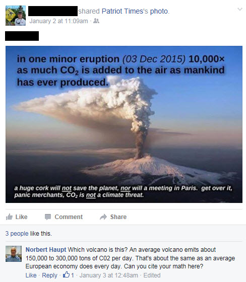
This seems to be a pattern on Facebook, as I came across this picture in my feed on January 2. I have redacted the name of the poster and recipient, since those are not relevant to my argument.
This poster obviously argued that “one minor eruption on Dec 3, 2015, pumped 10,000 times as much CO2 into the air as all of mankind has ever produced. He then insulted 97% of all climate scientists in the world by telling them to “get over it” and calling them “panic merchants.”
When I didn’t know what volcano he was talking about, I asked for more details. When the poster never responded, I did a 15 second Google search and realized he must have talked about the Mt. Etna eruption on December 3rd. There is plenty of documentation about that eruption, and another 30 seconds later I had the facts I needed.
Gas studies at volcanoes worldwide have helped volcanologists tally up a global volcanic CO2 budget in the same way that nations around the globe have cooperated to determine how much CO2 is released by human activity through the burning of fossil fuels. Our studies show that globally, volcanoes on land and under the sea release a total of about 200 million tonnes of CO2 annually.
— The Hawaiian Volcano Observatory explained how much CO2 is generated by volcanoes in a 2007 article
200 million tons of CO2 seems like an extraordinary large amount. However, the United States Geological Survey (USGS) found that the estimated amount of CO2 generated annually by human activity is 135 times higher.
In addition, volcanos also spew out sulfur dioxide, which can lead to volcanic air pollution. Sulfur dioxide gas reacts chemically with sunlight, oxygen, dust particles, and water to form volcanic smog known as vog. This actually offsets some of the CO2 greenhouse effect by doing the opposite: Inducing cooling by injection of pollution into the atmosphere. So volcanos are often actually balanced out.
It is easy to post a picture like the above in a Facebook feed and let it trickle down to the uneducated and uncritical masses in order to advance an agenda. If that agenda is well-funded by powerful lobbies like the petroleum industry, it can make a significant difference in public opinion. It looks legit, doesn’t it?
Usually 30 seconds of googling provides the facts, though.
A Columbia University study found that New York office workers spent a collective 5.9 years riding in elevators—and 16.6 years waiting for elevators. And that was just in 2010.
What?
In 2010, how many office workers only waited 16.6 years for elevators in 2010? There is just not enough information in this statement for it to make any sense. The link to the study points to this PowerPoint about elevator scheduling:
There is nothing in these slides that I could find that suggests 16.6 collective years of waiting for some undetermined number of New York office workers.
But it must be true, as everything on the Internet is.
This chart, created by Alissa Scheller for The Huffington Post, shows the average number of executive orders per year in office. My conclusion is that Obama did less executive orders than all presidents in 100 years. If course, it is not the sheer number of orders that matters, but the content and the reach, and that would not be analyzed and visualized as easily. But it is a revealing chart nonetheless.
The size of Africa, being in the center of the world map, often is distorted to its disadvantage. Greenland, Alaska and Siberia look huge, Africa just looks big. How big really is it?
Size of Africa [click for picture credit]As you can see on this map, Africa is bigger than most of Europe, the United States, China, Japan and India combined.
I believe in the power of prayer because I know so many people all over the world have been praying for me. I join you in prayer now for the recovery of others.
— Nina Pham, American Nurse and Ebola Survivor
So God saved three American healthcare workers from Ebola. I wonder why he chose to let 10,000 deeply religious and hard-praying Africans die?
Is it because we’re not praying for the anonymous Africans since we don’t know them and their names are not all over the news?
Might it be because Americans have lots of money that can buy very expensive medicine that Africans can’t afford?