It just occurred to me that I have posted in this blog for almost 18 years. For nostalgia reasons, I thought I should check the very first entry. Here it is:
On June 29, 2007, Apple released its first iPhone. The phone I described in the first post of this blog was a flip phone by Motorola. I didn’t pick up the iPhone until some years later. I went through the Droid phone first which came out in November 2009. It had a hard keyboard under the screen.
I just checked, and as of April 2025, it’s estimated that approximately 400,000 smartphones are retired daily in the United States.This figure is derived from annual estimates suggesting that around 151 million smartphones are discarded each year, equating to roughly 400,000 per day. So the numbers really haven’t changed much.
Smartphones are larger, but more flat. So I’d say they pretty much still would fill up a school bus … every day.
I found a little article in Scientific American of April 2025: Is the Lottery Ever a Good Bet? – by Jack Murtagh.
It starts with this:
Here is a thought challenge for you: Let’s say I have chosen a particular moment in time from the past nine years. I am thinking of a specific (and totally random) year, month, day, hour, minute and second between April of 2016 and today. Could you guess it? No chance? You have a better chance of guessing a specific second from a nine-year span than you have of winning Powerball.
I thought that short quote was a very powerful visualization of the odds of the lottery.
Clearly, playing the lottery is never a good bet, but it’s not about winning. I know too many people in Germany who have spent their entire lives, since I was a child, buying that Lotto ticket every week, and they still do it now, even in their eighties. “One day I might win!”
The lottery is not about winning, it’s about dreaming. The dream of possibly winning gives people hope and encouragement, and a will to move forward, even in adversity.
When I am preoccupied with our small lives, political upheaval, and a raging pandemic, it always helps me when I get some perspective on the my life, the world, and ultimately what really matters.
Invariably, I get drawn to astronomy, and visualizing the amazing distances involved. We even have this saying that when some number is huge, it’s “astronomical.”
At one time I speculated and visualized the size of our galaxy with respect to the sun. I wanted to know the distance to the nearest star if the sun was the size of a red blood cell. I documented that in this post Tangerines and the Size of the Solar System and Galaxy, which you might read again.
Recently I stumbled upon this video by a young man in Switzerland. He used a more humanly imaginable scale of the sun being 1 millimeter in diameter, or about size size of a grain of sand. After all, I am sure you can’t really visualize the size of a red blood cell of 7 micrometers. But we all know the size of a grain of sand. Here is his video. It takes a few minutes, but you will enjoy it.
You must admit, that after he walked away from his yard and got in his car, you were amazed, but then, as he kept driving, it brought it home more and more.
30 kilometers, or about 19 miles, is a huge distance from one to the next grain of sand. There is nothing else in between. Imagine a space ship having to travel that distance, and you quickly realize how unlikely travel between the stars actually is. Then think about that when somebody tells you about UFOs coming from “outer space.”
At that scale, our galaxy would be about the size of the orbit of the moon around the earth. Imagine a disk as big as the path of the moon around the earth, all filled with grains of sand (stars) being some 30 kilometers apart from each other on the outside, and a bit more dense in the center. This also helps with visualizing two galaxies colliding. Would stars ever collide, when they are grains of sand 30 kilometers apart in each galaxy? Not very likely at all.
This makes much more sense and gives a visual representation of the population centers in our country.
It does become obvious, however, that cities and college towns vote blue, the rural areas vote red.
Warning: This specific map is based on the results of the 2016 election – [note that Maricopa County (Phoenix, Arizona) shows red], but it gives a good idea regardless.
In the last few days, I saw some ridiculous comments about accusing Bernie Sanders as a hypocrite because he is a “millionaire” and therefore no different from Bloomberg. According to some statistics, Sanders’ net worth is estimated to be about $2.5 million. Many homeowners in California who bought their home more than 20 years ago are about that “wealthy” and they don’t consider themselves rich. But that’s a whole different scale from a billionaire.
Bloomberg’s published net worth is about $64 billion. Let’s visualize that.
Let’s pick a convenient time to start, say the birth of Christ, year 0 in our calendar. Let’s say you started working in year 0 and you worked 40 hours a week, and your hourly wage was $15,000 per hour. — No, not Sanders’ proverbial 15 bucks an hour of minimum wage, but 15 thousand bucks an hour.
Right about now, you’d have earned $63 billion. There is no interest, inflation or any other factor involved here. Just 2020 years times 2080 work hours per year times $15,000 per hour.
$63 billion is a lot more than what a “run of the mill” millionaire like Bernie Sanders is worth.
Here is a nice chart that shows how the debt grew under the various presidents. Things started to get nasty with Reagan and just kept doing. Trump is outpacing all that came before him.
Many Americans don’t realize how big Iran is. Iran is about four times as large as California or just about the size of Alaska. Geographically, it is the 17th largest country in the world. With 82 million people, it’s the 18th largest country by population and about the size of Germany, the largest country by population in Europe.
Here is a map showing Iran. It’s almost as large as Saudi Arabia, and it dominates the Middle East. It is a neighbor to almost all Middle Eastern countries.
It’s funny to see the country as it is surrounded by United States military bases. When you look at that map, it makes you wonder who is threatening whom?
What would we Americans think if there were Iranian military bases by the dozens all along the border in Canada and Mexico, as well as in Cuba, all over the Pacific, and in Greenland and Iceland? Would we feel threatened?
I am not a friend of the Iranian regime. It’s a terrible, oppressive, murderous country. But I know Iranian people, and I have a lot of respect for them.
Looking at this map makes me think:
What the hell are we doing messing with a country of this size, so far away, with no chance of making any difference, other than spending a lot of money and risking a lot of American lives (again)?
Today’s NASA’s image of the day is this stunning photography of the Galaxy M81 in Ursa Major.
Image Credit: NASA/JPL-Caltech [click to enlarge]I have taken the liberty of adding a little mark for illustration purposes. I added a tiny red circle at the end of the green arrow.
If M81 were the Milky Way, our own sun would be approximately where the little red circle is. A bit on the outside of one of the arms, far away from the center.
However, here comes the stunner: If this were the Milky Way, and our sun would be in the middle of the little red circle I drew, then all the stars we see with our naked eyes in our night sky would be within the little red circle. The farthest stars we can see are just a few thousand light years away.
Slave ships were large cargo ships specially converted for the purpose of taking slaves, especially newly captured African slaves to the Americas. Living conditions for slaves on these ships was inhuman. Men, women and children were crowded into every possible space leaving no room to move or even breathe. There was little food and the smell could not be described. Between 1526 and 1867 about 12.5 million slaves were sent by slave ships from Africa to the Americas. But only about 10.7 million slaves actually arrived. Of all human migrations it was the most costly in terms of human lives lost. The average time to sail across the Atlantic took from 60 to 90 days. Sometimes the trips took up to four months.
The video below shows the movement of slaves in over 15,000 journeys. Every one of the moving dots on this graphic is a journey of a ship holding hundreds of victims, for 3 or 4 months, in these conditions, against their will.
More than 10 million human beings were displaced in this fashion.
The scale of the slave trade and its injustice comes to life this video.
Los Angeles County is the largest county by population by far in the country, with 10.1 million. The larger metropolitan area, which spills into some other counties, has a population of 17.8 million.
If Los Angeles County were a state, it would be the 8th largest state. Only California (without Los Angeles), Texas, Florida, New York, Pennsylvania, Illinois and Ohio are larger.
Look at the map above. Los Angeles County, the little red speck on the map, is larger than every one of the states shown in blue.
And incredibly, to top this off, the upper half of Los Angeles County is all desert, so it’s really the lower half that counts for all the population.
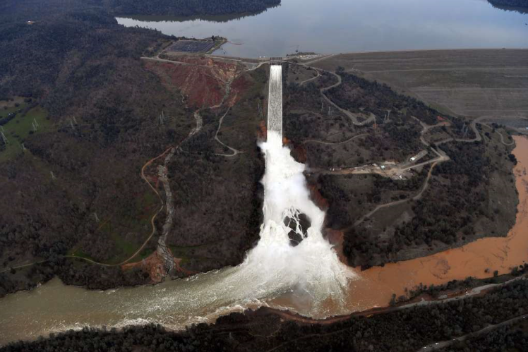
Here is the spillway of the Oroville Dam with the broken section. The emergency overflow spillway is to its left, and the main dam to its right.
The spillway releases about 100,000 cubic feet of water per second, that’s about 748,000 gallons per second.
For comparison, the American side (left) of Niagara Falls has a flow of about 150,000 gallons per second, and the Canadian Horseshoe falls (right) have another 600,000 gallons per second.
This means that the Oroville spillway has about the capacity of Niagara Falls in total.
Make sure you give it a good read, and scroll down slowly, all the way to the bottom. This is a good visualization for those who argue that “the climate is always changing” like some of our illustrious members of Congress.
Our own galaxy, which is a pretty unremarkable one, is estimated to have about 400 billion stars.
Let’s just say there is only ONE intelligent civilization in every galaxy that is active and alive today. Just one. That would make it two trillion civilizations.
There are about 7.5 billion human beings on earth.
That means that there are 266 intelligent CIVILIZATIONS in the universe for every human being alive – right now.