
I recently took a look at a map of food stamp use by state (courtesy chartsbin.com) and found an apparent correlation between food stamp use and Obama vs. Romney states in 2012.

It was sufficiently apparent to induce me to create a spreadsheet and do some calculations.
First I created the following chart, showing the states, their election results, along with the percentage of food stamp use.

Then I ran totals and percentage averages:
![]()
The results clearly document that red states have a higher participation in food stamps, on average, than blue states, but it is nowhere near as drastic as the map would have suggested.
This, of course, disregards the size of the state populations and therefore the results are skewed.
So I decided to add the population factor into the calculation by using the electoral college votes per state and weighting the above national averages accordingly. Basically a large state with a low percentage of food stamp participation, like California, brings down the average since it’s strongly weighted by the high number of electoral votes.
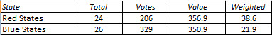
When I look at the results, it becomes obvious that red states have almost twice as many people on food stamps as blue states – on average.
A couple of surprising exceptions I noticed: Oregon and Michigan, both blue states, have very high food stamp participation numbers. California, my home state, shows surprisingly low.
Pingback: It Is Time to Rename Republican Radicals the 'Taker Caucus' - Page 2